
Santa Fe Dressage Association Case Study
Concept: Website redesign
Tools Used: Figma, pencils, paper
Duration: 3 months
Background
The Santa Fe Dressage Association is a non-profit organization whose mission is to promote the sport of dressage through education and recognized shows. They host various events, competitions, and meet-ups for dressage riders in the Santa Fe/Northern New Mexico region.
Dressage is a highly skilled horse riding form and sport dating back to ancient Greece.

Room for Improvement
While the SFDA had an existing website, the site layout was difficult to navigate for members and the user interface was dated and not in sync with the image the SFDA wanted to promote.

The SFDA site prior to the redesign.
Beyond aesthetics, the organization wanted a website that made it easy for members to view upcoming events, submit membership forms, and pay their annual dues.
My Solution
I created a site that is easy to use, functional, yet modern and refined. It achieved the client’s aesthetic goal but also established a website that was user friendly.

Some examples of the redesigned About and Events pages.
Competitive Analysis
Before I was able to get to the final stage of redesigning the website, I had to do some research on similar websites of other dressage organizations.
Part of this was based on what the client liked visually on other websites, but I also considered the functionality and flow of the competitors. What worked and didn’t work for a dressage website?
Many of them had their own issues, but two I used as reference were The Maine Dressage Society and the Santa Barbara Chapter of the California Dressage Society. On an aesthetic level, they both conveyed elegance and class.
Wireframes
The next part came in the form of a site map and low-fidelity wireframes. These were both crucial for getting an idea of how the new site would be organized.
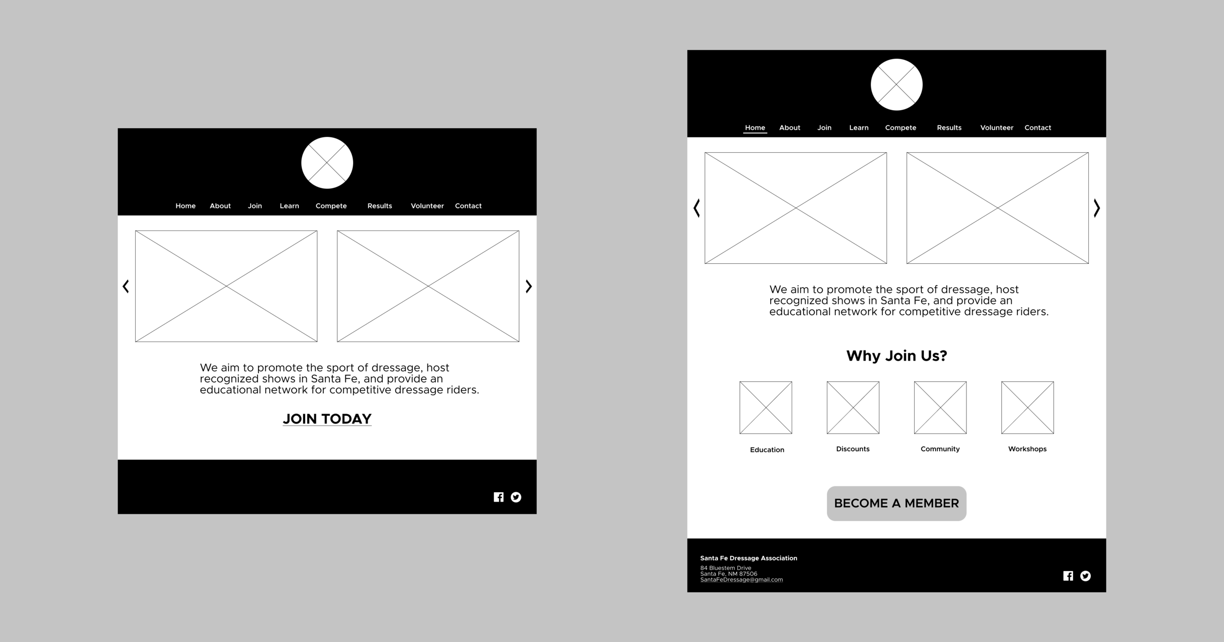
Some early lower-fidelity wireframes. The final design layout would be a lot different, but the minimal black and white color scheme would be kept.
I then proceeded to the actual design. I created a color scheme and design system and then implemented and arranged everything accordingly.
Challenges
The main challenges were creating a website that was classy, yet functional. A website might look refined and fancy but have a terrible user experience. I wanted to bridge the two together. The client wanted larger, high quality photos of various riders and events, but also a good portion of text information.