
Kanopy UX Case Study
Concept: Kanopy app
Tools Used: Figma, Post-its, pencils, paper
Duration: 2 weeks
My Role: Visual Designer
What Is Kanopy?
Kanopy is a film streaming service with a large inventory of content ranging from classical cinema to contemporary indie films.
Kanopy is free to use for any individual with a valid library card connected to a participating library.
While on a surface level Kanopy has a lot of aesthetic similarities to streaming giants like Netflix, their content is generally more serious in tone and thought-provoking.
The Problem
Early testing and research revealed that users were having issues navigating the app easily.
Additionally, with an app focused on connecting people to thoughtful content, there was not a platform to allow users to connect and discuss with others regarding the media they were viewing.
We wanted to determine what changes or features could be added that would enhance the user's ability to navigate the app and easily allow them to create and participate in content discussions.
Proposed Solution
My team and I addressed this situation by creating working prototypes of three brand new features for Kanopy:
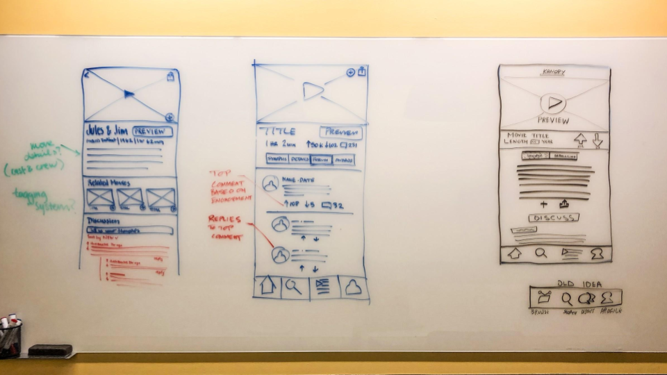
Discussion forum for users to interact with each other
Preview function on each movie details page
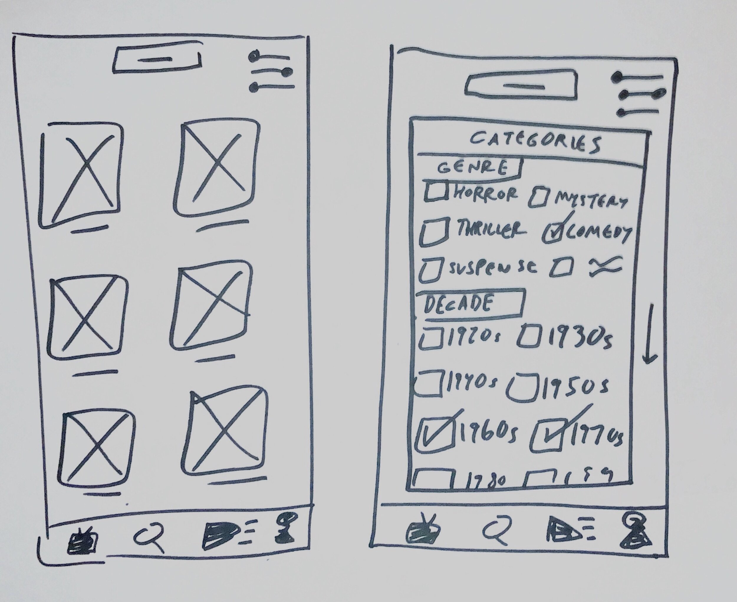
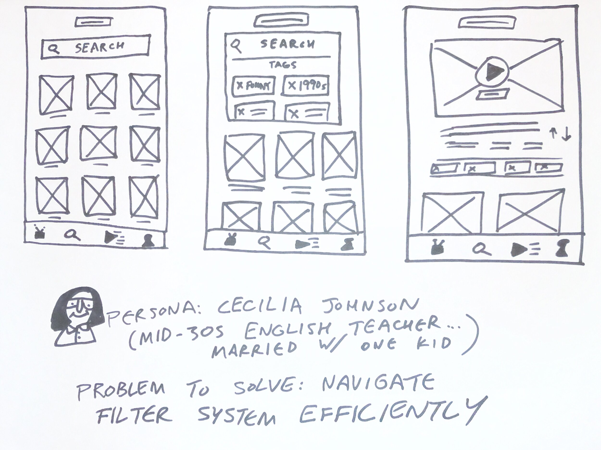
Advanced search function that utilizes a filter system to help users find relevant content

Interfaces showing our finished screens for the discussion forum, preview function, and filter system.
Research
Getting to a point where we could determine what features to prioritize and what problems exist within Kanopy's current app required a lot of research. From the very beginning of our project to the last few days of iterations, we conducted different types of research which can be broken up as follows:
Competitive Analysis
One of the first things we did was research the main competitors to Kanopy to craft a competitive analysis document. This helped get a grasp of what features were common in the video streaming app realm and what Kanopy was missing that could be beneficial. However, more research would still need to be done to validate such!

This research was done in September 2019, so features on these streaming apps could be different to their current state.

Field Research
For the next phase of our initial research, we headed to the Austin Public Library downtown to find participants to talk about and go through the app with us.
We all were able to find people at the library and go through the current Kanopy app with them, as we tried to determine some common pain points and also just observe their general flow through the app.
Personas
From here, we were able to synthesize our findings and come up with two personas for our Kanopy prototype. We wanted to have representations of two demographics that reflected common users.


Sketching & Wireframes
Once personas were fleshed out, it was time to start sketching. We began with hand-drawn low fidelity wireframes, shared our ideas with the team while giving feedback, then moved on to making final decisions to the features we would add.

User Flows
After we came to a consensus on what features we would be adding to Kanopy, I created and designed user flows for our personas. This user flow was used in usability testing afterward, but also helped identify where issues could occur along the way.

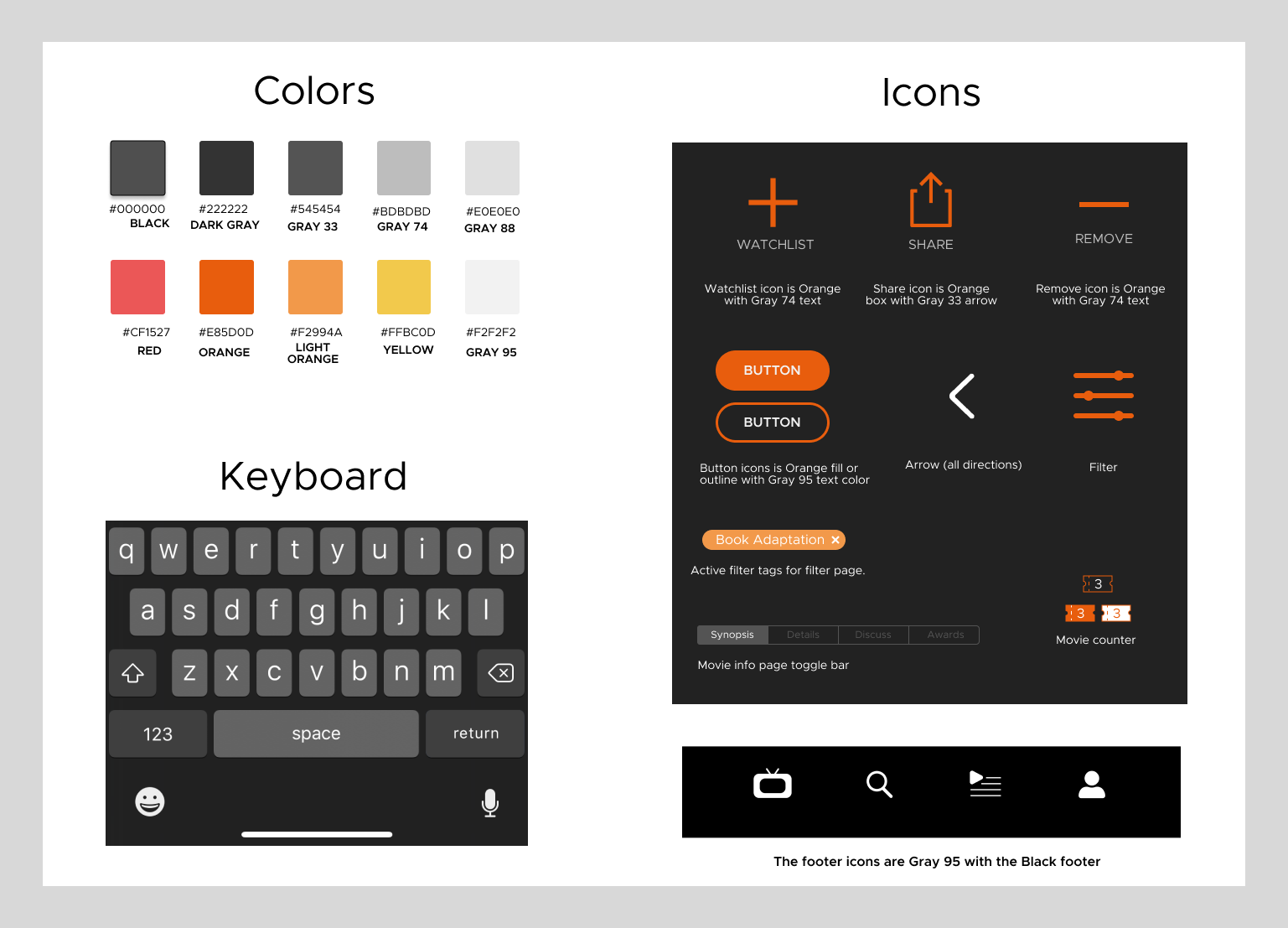
Style Guide
We had some initial research down, our personas fleshed out, and had made a decision on what features we'd be designing. Before we got too far into the thick of making wireframes and the prototype, we needed a visual reference for Kanopy's design.
As the Visual Designer, it was my role to help the team have a consistent reference for typefaces, colors, elements, and general design styles. We were not redesigning Kanopy's interface, so keeping it close to the actual app was important.
Ideations & Usability Testing
After we determined what needed to be prioritized, we split up and began designing higher fidelity wireframes. This was then combined into a fully functioning prototype. However, much more research was needed in the form of usability testing.
We got a lot of excellent feedback from the 10+ usability tests we conducted collectively. User feedback helped determine what needed to be altered and reworded/designed in order to have a user-friendly prototype.
Prototype
Once the wireframes were iterations, we worked on the final prototype to make sure it reflected what our usability test findings had. The video below demonstrates our persona Ben's user flow as he would navigate through the prototype.
Next Steps
The next step of this process would involve getting our current working prototype in front of more Kanopy users. This was a case study, but presenting and testing on the Kanopy staff and stakeholders would be crucial for gathering valuable feedback.
I would also like to continue working on both the advanced search function and discussion features. I believe more usability testing and research would allow us to refine these and enhance their accuracy and usability.
Overall, this project was a challenging and exciting way to experience the results of usability testing and research on our designs.